
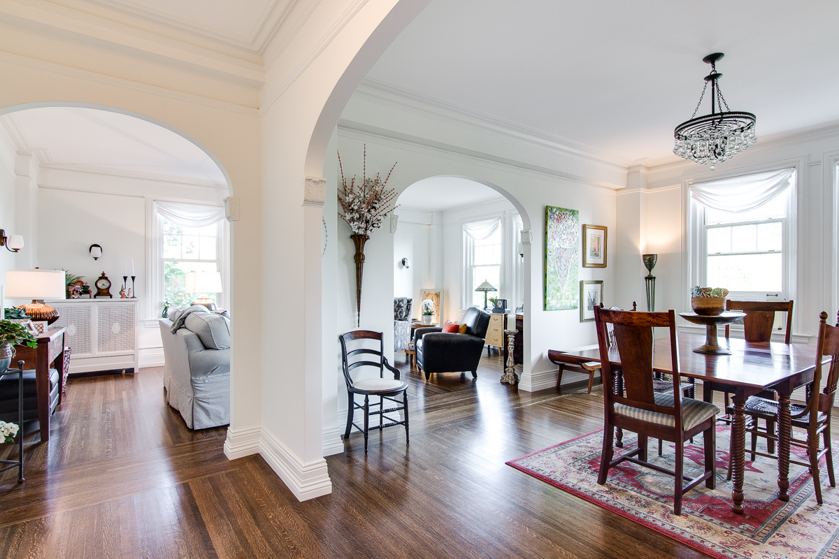
It’s not a design trick — it’s physics.
The way color interacts with light and space is straightforward science, but the results can be dramatic. Understanding a few key principles before you paint can make a significant difference in how a room feels — and how it photographs for a listing.
Light vs. Dark: The Basic Principle
Light colors advance — they visually pull walls forward, which counterintuitively can make a space feel smaller if overdone. Dark colors recede — they push walls back, creating depth and the illusion of more space. This is why a well-chosen dark color in the right room can actually make it feel larger, not smaller, despite what conventional wisdom suggests.
The Most Important Variable: Which Direction Does the Room Face?
Before choosing any color, get your compass out. Room orientation is the single most overlooked factor in color selection:
- North-facing rooms receive consistent, cool, indirect light all day — the most forgiving for color. Artists have preferred north-facing studios for centuries for exactly this reason. Blues, greens, and cooler neutrals perform beautifully here.
- South-facing rooms receive warm, direct light that shifts dramatically — cool and shadowy in the morning, bright and warm in the afternoon. Warmer tones tend to work better here.
- East-facing rooms get bright morning light that fades by afternoon — good for warm colors that benefit from that morning boost.
- West-facing rooms are the opposite — subdued mornings, golden afternoon light. Warmer colors can feel glowing; cooler colors can feel flat.
Practical Tips for Using Darker Colors
Darker colors are having a sustained moment in interior design, and for good reason — when used correctly, they add depth, warmth, and a sense of intentionality that light rooms can’t always achieve. A few principles that consistently hold up:
- Dark colors love white trim — the contrast is what makes them work
- Dark colors love mirrors and metallic accents, especially warm metals like brass or gold
- Navy and dark blue pair exceptionally well with black
- Cooler dark colors (navy, slate, deep teal) will make a room feel larger than warmer dark colors
- To make a ceiling appear higher, paint it slightly darker than the walls — and don’t overlook the floors. Dark floors appear to recede and go deeper.
- To make a room feel longer, paint the back wall dark and keep the side walls lighter
- Lighting the corners of a dark room is essential — without it, the depth effect becomes oppressive rather than dramatic
- For deep colors like navy or black, an eggshell or satin finish outperforms matte — but only on very smooth walls
A Color Worth Knowing: Benjamin Moore Van Deusen Blue
If you’re looking for a dark color that works across a range of room orientations, Benjamin Moore’s Van Deusen Blue is a consistently strong performer — a deep, rich navy with enough warmth to avoid reading cold, and enough depth to create genuine drama in a north or east-facing space.
The Bottom Line
Color is one of the least expensive, highest-impact tools available to sellers preparing a home for market — and to buyers thinking about how to make a new space feel like their own. Get your compass out before you open a paint chip, and let the room’s orientation guide the palette. The science will do the rest.
Thinking about selling and want to discuss how to prepare your home for market? Contact Maguire Group Realty to talk through your options.